
User experience
Imagine walking through an unfamiliar city to reach an important appointment.
You walk through various streets and neighborhoods you see for the first time, following different signs and markings ahead of you.
Occasionally, you must go through slow automatic doors that require waiting for them to open after pressing a button, while unexpected detours lead you to even more maze-like neighborhoods.
All these delay you from your appointment, increase your stress, and distract you from reaching your final destination quickly.
People using the internet are on a similar journey.
Every action they take is a step closer to what they are searching for.
And, as in the previous imaginary example, their journey can be interrupted by delays and obstacles, distracting them from their destination and leading to mistakes.
Mistakes in turn can lead to decreased satisfaction and ultimately abandonment of a website or even the entire journey.
Removing obstacles to the final destination and improving the user’s journey on a site is key to a satisfied user. This is simply called “User Experience”.
User Experience is the feeling people have when browsing a website, using an application, or interacting in any way with digital products or services.
In the design world, there are 2 terms to keep in mind when creating and managing online information: UI (User Interface) refers to how something looks, and UX (User Experience) refers to how something works.
Image 7.1: UI - UX (source: indiehackers.com).
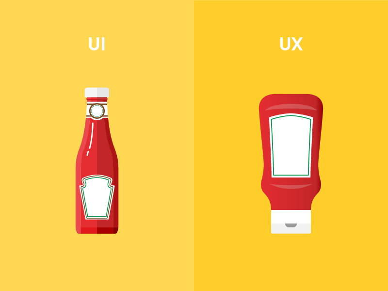
The above image shows two ketchup packages. The left one is more appealing — a glass bottle with a nice shape opening at the top. The right one is a plastic, flexible bottle that opens from the bottom. Not as nice as the glass, right?
Relying only on appearance (UI), one would likely choose the left ketchup package.
But things are different during use (UX).
Thick ketchup flows with difficulty from the glass bottle, which one must hold upside down for a while waiting for contents to come out.
In contrast, the plastic bottle opens at the bottom, meaning the content is at the output, and the ability to squeeze the bottle pushing ketchup out makes usage friendlier.
User Experience is the most important factor for a website’s success.
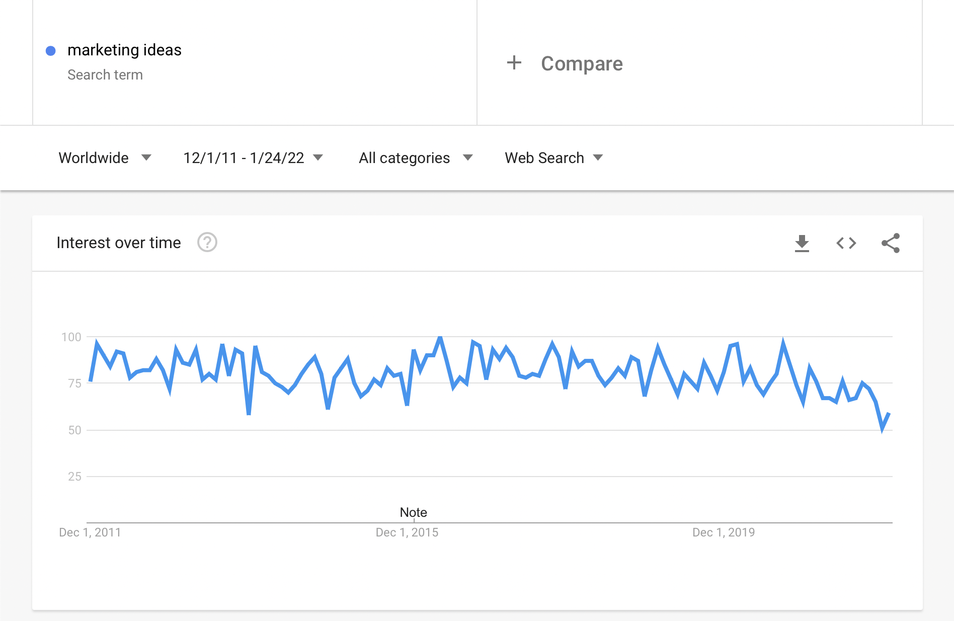
It’s no coincidence that User Experience keeps evolving and gaining importance over the years, unlike terms like User Interface (which remains stable), Conversion Rates, or Marketing Ideas.
Image 7.2: Interest in UX over the past decade (source: trends.google.com).
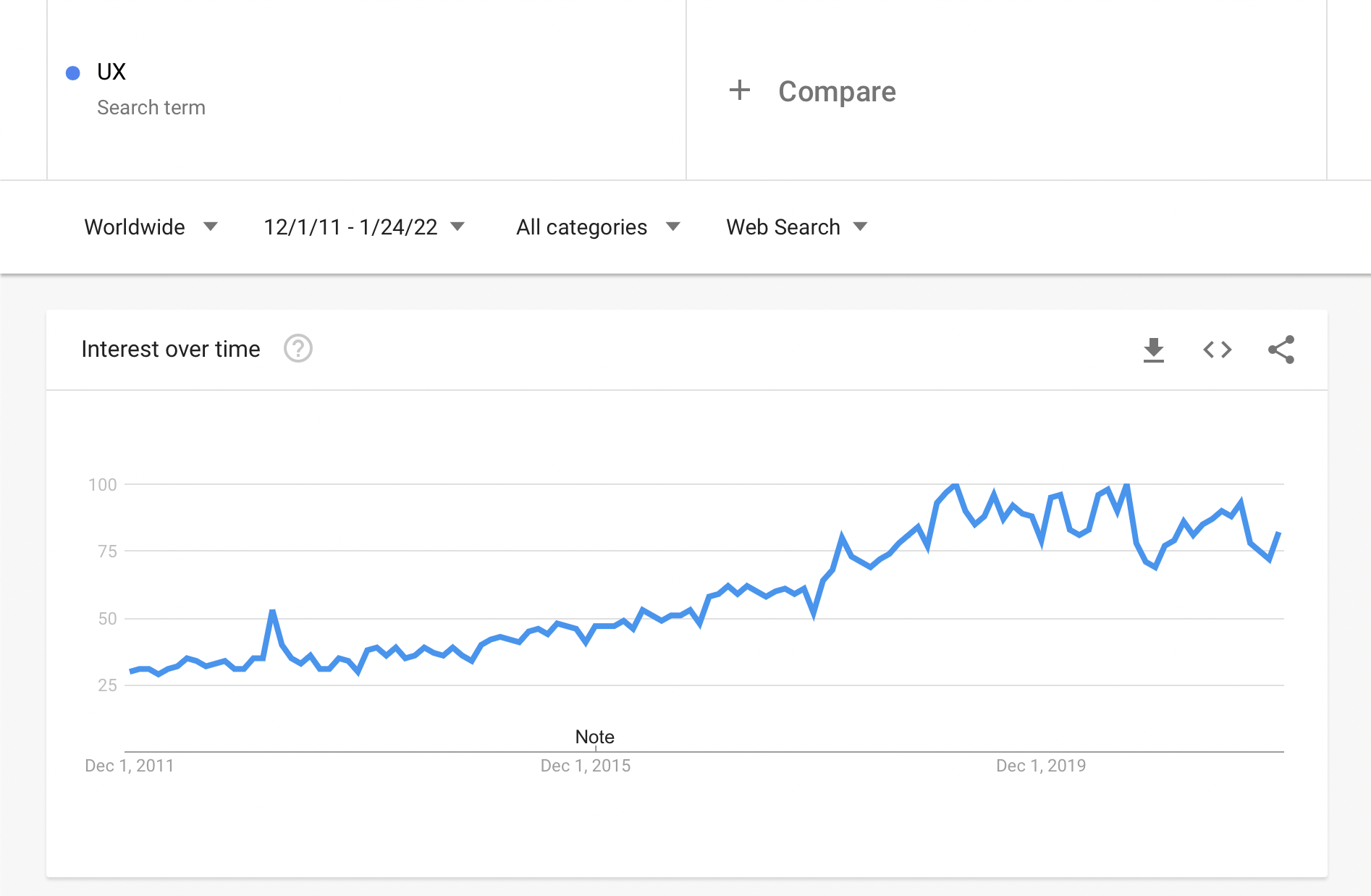
Image 7.3: Interest in Marketing over the past decade (source: trends.google.com).
UX is so important that LinkedIn ranked it in 2020 as the 5th most important skill companies seek in new employees.
Big internet companies today realize creating user-friendly products determines success.
Good User Experience increases chances to prevail over competition.
So many companies now invest in creating great products instead of spending millions on marketing like before.
If this matters for the biggest internet companies, it surely matters equally (or more) for smaller presences like a small site or a new site.
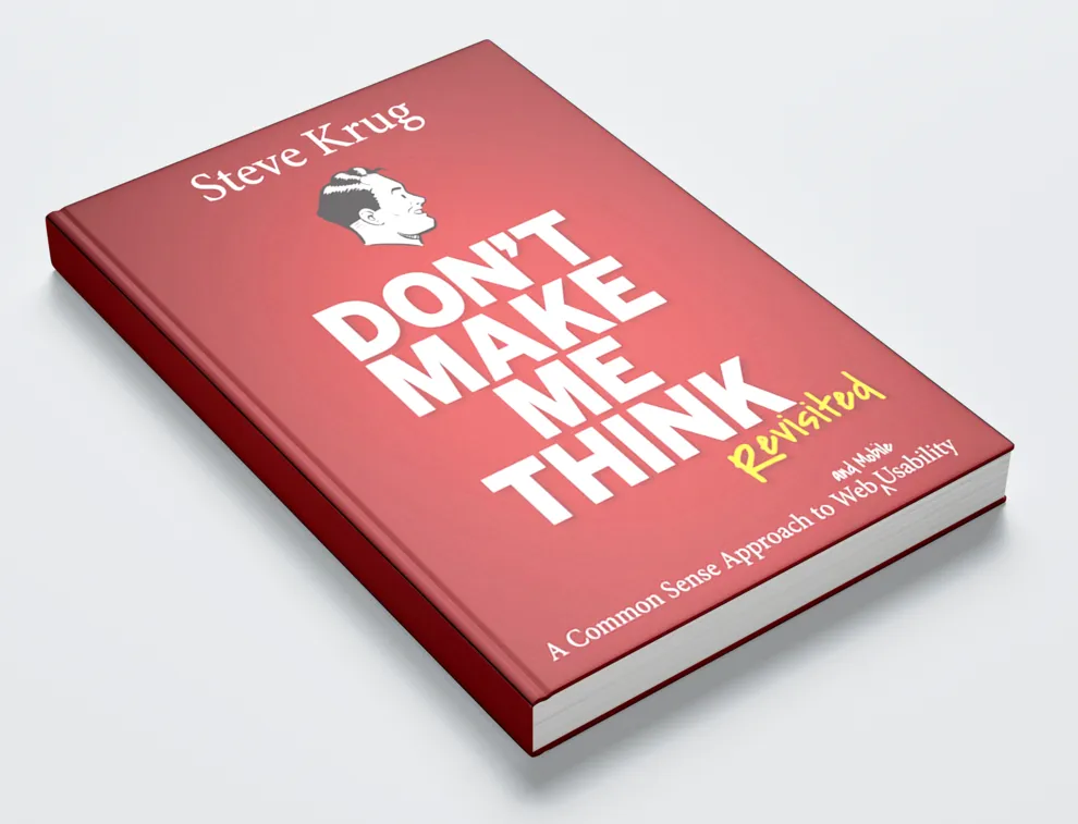
Don’t Make Me Think
In 2000 Steve Krug, a professional User Experience expert (also called usability), wrote his book “Don’t Make Me Think”, which became hugely successful and a reference for how sites should operate.
Though 22 years have passed and technology changed, the book’s principles remain unchanged.
This is because usability concerns human psychology, which changes and adapts slowly.
The book, highly recommended for all (whether internet professionals or not), was updated in 2013 with new examples and tips for mobile internet use.
Image 7.4: Cover of “Don’t Make Me Think” by Steve Krug (source: boagworld.com).
According to the core idea, something is usable if an average person can figure out how to use it to achieve a result without exerting more effort than it’s worth or should require.
Steve Krug outlines 3 rules for how websites should be designed and work:
-
Rule 1. Don’t Make Me Think. This is the general rule. Whenever a user has to pause (even briefly) to think about something, their attention is distracted from the action you want them to take. Your goal is to make your website super easy to use, e.g., everything does what is expected. A website is intuitive when users “get” what it is and how to use it without thinking. Empirical rules: (i) links and buttons must be clearly clickable and (ii) use obvious words for everyone (calls to action). Avoid technical jargon, clever but confusing marketing phrases, or terms specific to your industry or company.
-
Rule 2. Every Click Should Be Obvious. The result of clicking something should be obvious so users don’t have to guess what happens next. Krug believes the total number of clicks doesn’t matter much as long as each click is self-evident and clear. One exception is slow internet where fewer clicks matter more.
-
Rule 3. When You Finish Adding Content, Cut It in Half. Remove unnecessary words to minimize distractions, let main content stand out, and shorten the page to minimize scrolling. Exceptions are news or content-rich articles.
Much of following these rules depends on website design, often done by professionals using templates/themes.
A common mistake is overusing flashy colors, hidden menus, and moving images and texts.
How user-friendly are these? In my opinion, not at all!
They confuse me, make me dizzy, and I cannot even read the information if I stay on such a page, typically abandoning it within seconds.
They might be impressive but would you want a flashy car that doesn’t run?
For small sites I designed like Arahova Pansion, I usually choose simple layout and light backgrounds for easy reading.
Almost always a simple clear navigation menu under the logo and a main content column with text and required images/videos.
Unlike my projects, working with top designers at Skroutz.gr, one constant is simplicity and content structure with “self-evident” design and continuous effort to identify and remove anything hindering visitors!
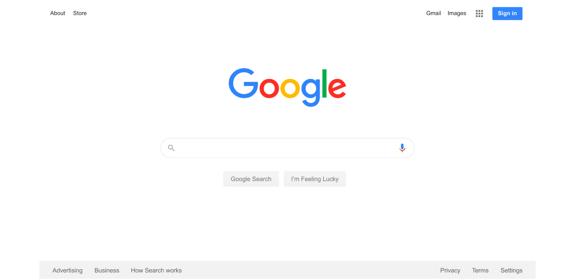
The most successful internet company, Google, has a homepage that is the simplest one can imagine: a logo and a search box, with very few links (log-in and product info).
Image 7.5: Google Search homepage.
Don’t ask too much from users.
The fewer actions required for conversion, the more likely visitors will convert.
Visitors new to your site don’t want to fill big forms to create an account they may never use.
Give them chance to use your site and offer without forcing lots of personal info.
The simpler, the better!
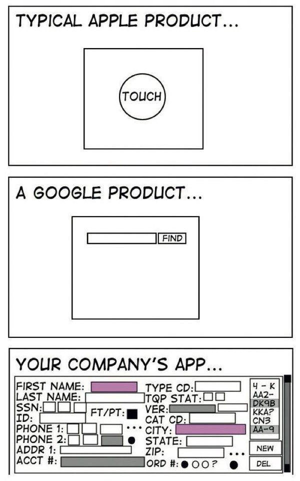
Image 7.6: Product simplicity (source: Eric Burke, stuffthathappens.com).
What one should do to create something on the internet, in my opinion, starts with learning more about UX through books, articles, videos, blogs, etc.
Also, if one has a budget for an online presence, consider investing in professional User Experience research rather than running ads.
Finally, use your own online presence as a visitor (if possible); if anything irritates you, it likely irritates others.
Recognizing and fixing such obstacles greatly improves the final result.
Navigation
Proper website navigation is the heart of good User Experience.
A Tank Design study published in Forbes states bad navigation can cost a fortune.
If navigation fails visitors’ expectations within seconds, visitors likely leave and never return.
Different research by UX expert Jakob Nielsen shows average page visit lasts under 1 minute, so if navigation fails, site cannot prove its worth.
Visitors failing to quickly and easily find content or functions move quickly to competitors.
The result? You lose!
Website navigation is the main road to success.
Good navigation helps visitors quickly find what they want, improves conversion rates, and boosts page rankings.
What are the basic principles of good site navigation?
Navigation lets users move between pages by providing links in various forms until they find desired content.
The most common layout is a horizontal navigation bar at the top of every page (header).
These bars offer side-by-side links to main site pages, like a horizontal table of contents.
Usually navigation links remain consistent on every page, easing quick access.
Dropdown menus reveal a list of links when clicking or hovering over a menu item.
Not recommended for regular navigation but useful for very content-heavy sites to avoid cluttering pages.
They work by showing top-level categories as main menu and subcategories below.
Footer menus appear at the bottom of pages with links often for legal, contact info, etc.
Footer menus usually have more links but don’t disrupt user-friendly design.
Sidebar menus are vertical navigation bars typically stacked down the side.
Less common main navigation choice; users less familiar.
However, they allow showing more items and offer unique page aesthetics.
Breadcrumbs show visitors their current page location and path taken.
Named after Hansel and Gretel who used bread crumbs to find their way home.
Breadcrumbs usually show top-level pages on the left with “>” to lower levels on the right.
This lets users quickly return to previous pages.
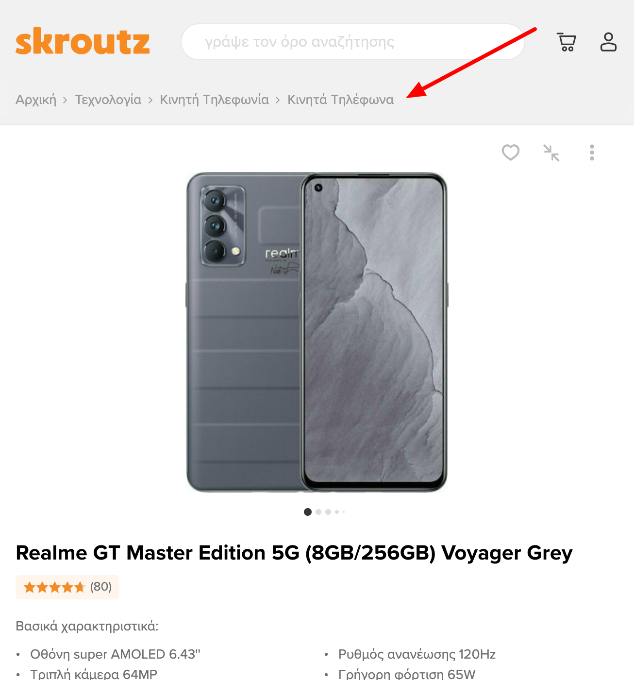
Image 7.7: Breadcrumbs on Skroutz.gr.
Content linking (e.g., link in text flow) is an important though not strictly navigation tool.
Sometimes it’s handy to have links scattered in content highlighting keywords or phrases linking to related site content.
Besides helping users find info, such links give the impression your entire site content is interconnected.
Site size dictates how much of these navigation options are used.
Small sites benefit from a main navigation bar with basic sections (5-7) with or without dropdowns, links within content, and footer links (terms, contact) for good UX.
Sidebar menus are optional and can be avoided.
Breadcrumbs are common for all site sizes.
No universal solution exists for large sites; optimal navigation differs by need.
Mobile navigation commonly uses hamburger menus.
Navigation elements must be clear and distinct.
Though obvious, ensure all navigation components are visible.
Put yourself in a user’s mind where they expect navigation on each page.
Ensure link colors contrast with content.
With many visitors using mobile, navigation should be placed and respond well on small screens, e.g., hamburger menus, keeping main content clean.
Maintain consistent navigation design language across your site to avoid surprises.
E.g., don’t move a product page link from header on one page to footer on another.
Sites that work well keep navigation style simple and consistent, providing users ways to explore and sticking with it.
No surprises.
Navigation elements must clearly describe destination page content.
Visitors must trust where clicking takes them.
Balance description with link length; overly vague link text confuses users and may harm SEO ranking.
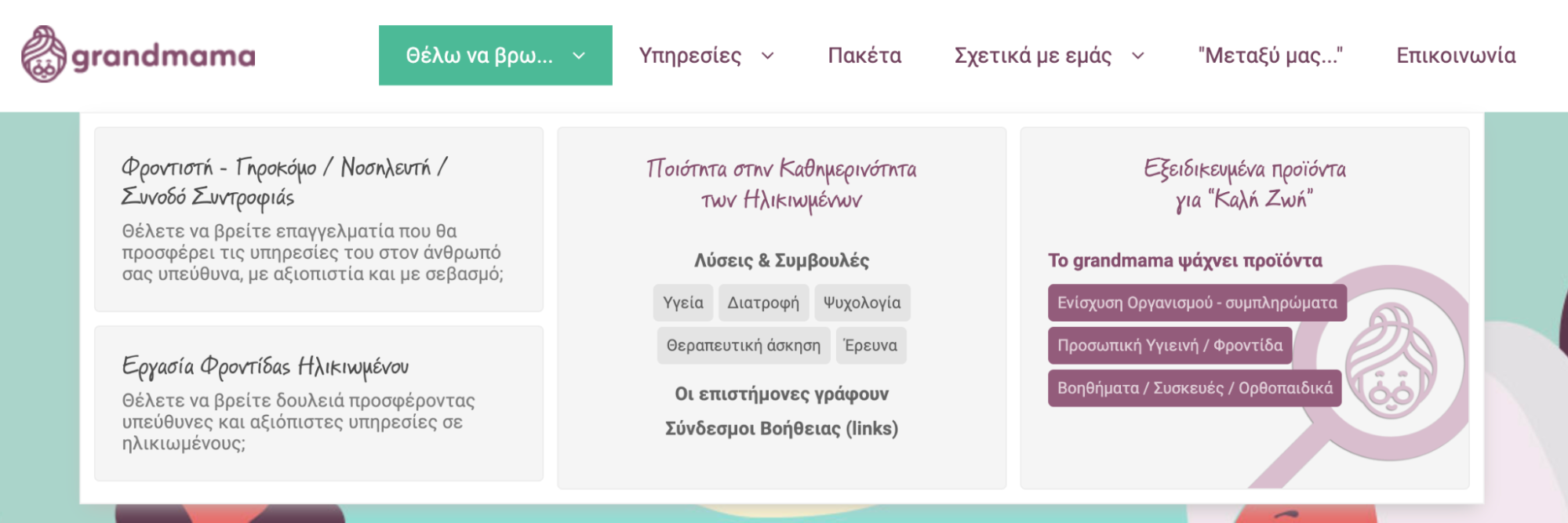
One less good example from my experience is grandama.gr; its owner asked for advice to increase search traffic.
Visiting and exploring grandama.gr trying to identify main sections (business goal is elderly home care), popup menu had long phrases, poor hierarchy, different fonts/styles, many colors, making it difficult to understand (fig. 7.8).
This indicated design and hierarchy needed fixing and menu word choices improving (e.g. what “Μεταξύ μας” means).
Image 7.9: grandama.gr popup main menu.
Navigation must distinguish from calls to action.
A call to action (CTA) is a link, often a button, inviting visitors to perform an action (usually conversion).
CTAs differ from other navigation elements as they don’t just help find content but redirect users in a new direction.
They must stand out clearly.
Your homepage may have main navigation, footer links, and other content links.
But if there’s a page where you really want visitors to go, use CTAs to guide behavior.
Also minimize navigation clicks.
After site landing, visitors should reach info or action in minimal clicks.
So, place links to popular or important content in main navigation.
Pages in main navigation should have high or strategic traffic goals.
As in the example of grandama.gr above, nothing destroys user-friendliness and elegant navigation design more than too many navigation elements (overloaded navigation menus, or mega-menus).
Although helpful for web designers to hide many links, users frequently find dropdown menus annoying.
The idea behind a header navigation bar is to present the most important or frequent links you want visitors to follow.
Adding too many elements makes users spend more time trying to find the right content links, worsening the overall page appearance.
If you find too many links in your main menu, consider moving less important ones to the footer menu.
Clearly, navigation links should lead to correct pages, as links to deleted pages or wrong URLs are common.
Thus, navigation links should be regularly checked and obsolete ones removed.
Basic website navigation menu criteria:
- Be convenient.
- Be clear and compact.
- Communicate function and content directly.
- Be accessible from any page area.
- Be responsive on all devices, especially mobile-friendly.
- Be easily accessible and user-friendly.
Start by defining the hierarchy of information display.
Design site navigation in detail on paper first.
Use a sitemap, diagram, Excel spreadsheet, or any comfortable tool.
Adhere to the three-click rule.
This basic UX rule states no internal page should be more than three clicks away.
It removes obstacles in user journeys, shortens paths, and increases satisfaction with minimal sacrifice.
Place important links either at the start or end of navigation.
People tend to remember items at the beginning and end of lists better, rarely recalling middle items which may be less impactful.
Thus, critical links should be at navigation edges.
For example, UX experts recommend placing “Contact” as the last item (common practice).
Use clear and specific wording.
Choose words meaningful to users, even if non-technical.
Avoid vague terms like “Services” or “Videos”.
This helps visitors find targeted info and can improve SEO.
Use 5-7 links max, especially in primary navigation.
People cannot hold more than 5-7 items effectively in short-term memory.
Numbers 5-7 optimize navigation focus.
If more links are needed, group logically and format for readability.
Use common, readable fonts.
Avoid elaborate or unusual fonts that hinder quick scanning.
See earlier image 7.8 for example of poor text scanning.
Ensure strong contrast ratio (preferably 7:1) between menu text and background.
But beware, very high contrast can reduce readability (test with online tools like https://contrast-ratio.com/).
Maintain consistency in format, style, and design.
Navigation should remain uniform throughout the site.
Ensure navigation appears and works well on mobiles and various screen sizes.
For small screens, use font size at least 16px, ensure links are tappable with enough spacing to avoid errors.
Be careful and sparing with dropdown menus.
Though they add space for many links, dropdowns have drawbacks:
-
Visitors may struggle handling them.
-
Users tend to skip important pages hidden in large dropdowns.
-
They are disliked by search engines.
If used, keep them clean and reliable, like mega-menus in popular ecommerce sites.
Image 7.10: Ebay main navigation dropdown menu.
Image 7.11: Asos main navigation dropdown menu.
Always indicate where visitors are (e.g., breadcrumbs, highlighted font for current page).
Avoid confusion.
Use common navigation conventions from the web to smooth experience, even for first-time visitors.
Align navigation with business goals or marketing strategy.
If including a call to action or special offer in the menu, design it to stand out, communicate purpose clearly, yet remain user friendly and clean.
Listen to your customers.
Test and collect feedback to find the best navigation.
If unsure, consult professionals familiar with navigation patterns matching your project.
Image 7.12: arahova-pansion.gr main menu: key pages reachable in 1 click, all pages within 2 clicks.
In summary, select your site’s main pages to include in primary menu.
If more than 5-7, group logically and keep manageable number, revisiting business goals for alignment.
With primary navigation links, request or choose a user-friendly accessible design and placement.
Finally, use secondary navigation like breadcrumbs, footer links, and inline content links.
Capture interest, then offer (few) choices
A 2015 Microsoft study reported by TIME says people have an attention span of about 8 seconds, less than a goldfish memory.
Whether true or not, every page has little time to capture visitor interest before loss or task abandonment.
Content creators often assume user attention for their work, but that is often false.
Bounce Rate measures visitor exits without interaction.
High bounce rates usually indicate content, UX, or design problems.
Test yourself searching info online: you scan pages briefly deciding if relevant.
That minimal time is critical for site success.
You must convince visitors you have answers so they invest more time.
Users leave mainly because:
-
Low page quality, no appeal.
-
Visitors mismatch page purpose.
-
Visitors found info and leave.
Though high bounce isn’t always bad, one must understand its cause.
Example: Nissan.com visitors mostly expect Nissan Motors homepage but find a computer parts site.
Alexa data: average stay on nissan.com is 30 sec, while on nissanusa.com >4 min.
Thus most nissan.com visitors seek cars, not parts.
Domain confusion harms business.
Similar cases exist where typo domains (yuotube.com, faecbook.com) attempt to steal traffic, often misleading or illegal.
Visitors stay only seconds on fake sites.
Why subject users to that?
Instead, provide compelling content attention deserves, supporting final conversions.
Capturing interest is usually a simple choice, a part convincing enough to continue.
Many options usually produce opposite effect — analysis paralysis.
A famous study placing 24 jam flavors in a supermarket vs 6 flavors found fewer options led to higher purchase rates.
Too many choices decrease conversions and increase bounce.
The whole page should guide visitor to confirm the page answers then offer choices to take right action.
How to captivate users?
In information-overloaded society, we filter information to save time.
UX experts know people react to movement.
Peripheral vision evolved to detect danger and is sensitive to motion.
Humans scan for threats but love cartoons.
Alongside animation, human faces looking at us capture attention powerfully — a strong persuasion tool.
Image 7.14: A human face looking at us captures attention (source: unsplash.com).
Bright colors and large images also attract attention.
To test if something stands out, look from 1-2 meters — the dominant visual element pops out.
Novelty triggers curiosity.
Unusual graphics and illustrations immediately draw audience attention.
Show, don’t just tell your story.
Target primal human instincts: Can I eat it? Can I have sex with it? Will it kill me?
This powerful trio of questions runs deep psychologically.
Knowing this, use it to attract attention.
Food: everyone loves it; delicious food images create positive experiences.
Sex: depending on demographics, images of attractive people garner strong interest.
Fear-based tactics can also influence visitors (e.g., “Starting a new site is often not as planned” builds risk awareness).
Emotions influence human experience; well targeted emotions encourage exploration and learning.
Visual storytelling through video builds deeper emotional bonds via music, sound, voices.
People love stories; your website tells your unique story, attracts emotion and interaction.
Imagine driving in a foreign country without language knowledge. How do you know when to stop? A big red octagonal STOP sign with clear white letters is a universally known UX visual cue.
People pay attention only to important elements, so know users’ needs to create authentic, impactful signs and symbols.
Such signs resonate if they show empathy, relate to users, and show you listen and solve problems.
Once placed, enhance with other tools to highlight messages.
Contrast also captures visitor attention. Use images, graphics, or videos showing before/after, dos/don’ts to engage audiences.
Visitors want good choices and avoidance of bad ones — just show them how.
Provide valuable, entertaining, appealing messages.
Never try to deceive users; clickbait harms trust and reputation.
Focus on quality, interesting, valuable, relevant content to win attention and users’ hearts.
The most important site elements should be “above the fold” — visible without scrolling, grabbing interest to invest time and attention.
“Above the fold” term comes from newspapers referring to the top half visible when folded.
Image 7.16: Above the fold newspaper section (source: epicnine.com).
Above the fold also applies online — site parts seen immediately on device without scroll.
Anything visible after scroll is “below the fold”.
Layout of attention-getting content above the fold is crucial as visitors see it immediately after loading.
Such content draws more attention than any page part.
Above the fold content often decides if visitors stay or leave.
Every page should have a single clear goal; added elements must aid that goal, not block it.
If multiple key goals exist, consider splitting the page.
Helping visitors with solutions smartly, originally, entertainingly, respectfully to their time yields great success.
Keep in mind:
-
Choose simple layouts, large fonts, clear colors. Keep it simple. Avoid making visitors think.
-
Good UX means everything visible must be obvious - clear purpose and location. Info should be simple, concise, and focused.
-
Short pages with concise info, simple layout, clear call to action outperform others.
-
Offer choices, but not many on one page. Ease next click.
Cover image source: Unsplash.com